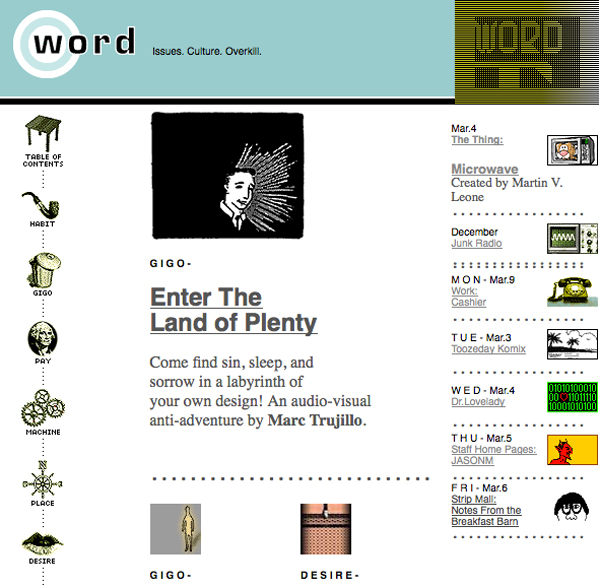
Conceived by Carey Earle, Tom Livaccari and Dan Pelson and launched in 1995 by Icon CMT, Word.com was one of the earliest webzines. Unlike many web publications of the time, which simply re-created the print magazine format online, Word.com was a true multimedia experience, incorporating editorial, animations, games, audio and chat.
Icon’s smart move was to hire Jaime Levy as Creative Director, one of the few people who had experience of digital publishing, having produced a floppy disk magazine, Electronic Hollywood, in the early 90s. Jaime put together a killer team of writers and designers with similar attitudes to her, one of whom was Editor Marisa Bowe, who she had met online at Echo, New York’s equivalent of the San Francisco community site, The WELL.
Like Marisa, Word was smart, funny, inclusive and made-for-web. Determined not just to comment on and recycle mainstream media, Word published original content that blurred the line between high and low culture. Marisa says, “We were sick of cultural theory, media commentary, and pundits, so we ran mostly first-person essays. It wasn’t over intellectual but it wasn’t stupid either.”
Another Levy hire was Art Director Yoshi Sodeoka, who shared Levy and Bowe’s vision for authentic, multimedia storytelling. According to Yoshi, “Word existed from 1995 when the web was total shit. Nobody knew what they were doing. So, artists like us could get paid to do a lot of crazy, experimental stuff.” Yoshi and his colleagues at Word were particularly frustrated by the webs lazy adoption of the print paradigm, they felt that a web page should be more akin to directing a film than laying out pages. Jaime said at the time, “In the world of Word, we don’t just read ‘See Spot Run,’ we have a three-dimensional encounter, in which Spot not only barks and bites but in which you might want to carry a pooper-scooper.” Jaime and Marisa were critical of the rest of the web (all 23,000 sites), Jaime saying “Nobody is doing anything as interesting as Word, I wish someone would try and kick our ass” and Marisa describing most websites as “like frosting with no cake.”
Word’s irreverent mix of first-person, confessional editorial, art, audio, animated Gifs, interactive toys and chat bots with attitude was soon attracting almost 100,000 page views a day. Such was the site’s popularity, that when Netscape went public in July ’95 and the New York Times took a full page to explain what a web browser was, the website they used as a reference was Word.com.
Perhaps best known for the interactive game SiSSYFiGHT, the chat bot Fred The Webmate and Gig, a book based on personal accounts of peoples jobs (from farmhands to strippers), Word’s authentic content and icon-driven design influenced hundreds of other sites and to my eye, the site stands the test of time today.
Watch an interview with Marisa Bowe on the Digital Archaeology YouTube channel.

Pingback: Viewpoint: The Argument | Digital Archaeology
Pingback: Chapter 6: Web Design | CSS-Tricks
Pingback: Chapter 6: Web Design | CSS-Tricks - Latest Digital Marketing News, Website Design & Development, Graphic Design
Pingback: Chapter 6: Web Design | CSS-Tricks - DzTechno - DZTECHNO!
Pingback: Chapter 6: Web Design – The Programming. Nche Domain News
Pingback: Chapter 6: Web Design | CSS-Tricks | | News Gossips.com
Pingback: Chapter 6: Web Design - WP Guy News
Pingback: Chapter 6: Web Design – My Blog
Pingback: Chapter 6: Web Design | CSS-Tricks | PikoPong - Tech News
Pingback: Chapter 6: Web Design - Marketing Solution Australia
Pingback: Chapter 6: Web Design – WordPress Website
Pingback: Chapter 6: Web Design - INFOSHRI
Pingback: Chapitre 6: Conception Web | Astuces CSS – 1dmx Actu internet
Pingback: Chapter 6: Web Design – Programming